Last updated: July 12, 2026
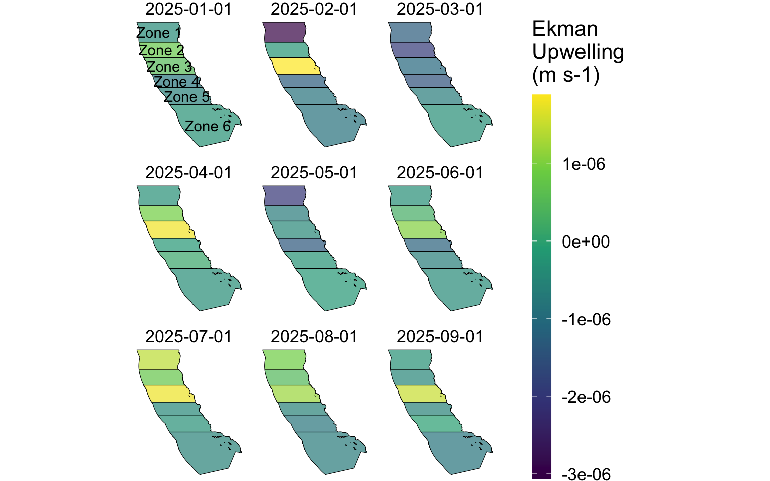
This is an example dashboard demonstrating how to acquire, summarize, and visualize environmental data from a product on ERDDAP. Below are some examples of ways that these results can be visualized through tables and plots.
Latest data
2026-06-01
Latest min upwelling
-1.685498e-06
Latest max upwelling
4.515769e-07