Exploratory analysis in Shiny
28 October 2025
Source:vignettes/Exploratory-analysis-in-Shiny.Rmd
Exploratory-analysis-in-Shiny.RmdIntroduction
The creation of maps is essential to understanding animal movement patterns over space and time, but these maps nearly always show spatial patterns at the expense of time. The “flattening” of temporal patterns of animal movement over geographic space can preclude a detailed understanding of how animals move across a landscape (or seascape). This is particularly true when individuals exhibit high site fidelity or there are many overlapping tracks from multiple individuals.
During the data exploration stage, it is particularly useful to become familiar with relationships between movement patterns and covariates of interest. However, this process can be difficult when practitioners only rely on static maps that obscure the temporal pattern exhibited by an organism.
As an example, below is a static plot of the sese
(southern elephant seal) dataset (Jonsen et al., 2019) included within
the aniMotum package (previously called
foieGras) (Jonsen et al., 2023).
library(bayesmove)
library(aniMotum)
library(sf)
library(rnaturalearth)
library(dplyr)
library(ggplot2)
library(lubridate)
library(datamods)

# Load data
data(sese)

# Change column names to match required names for shiny_tracks()
# Change projection to calculate step lengths, turning angles, and net-squared displacement metrics
sese.sf<- sese %>%
  rename(x = lon, y = lat) %>%
  st_as_sf(., coords = c("x","y"), crs = 4326) %>%
  st_transform(crs = "+proj=laea +lat_0=-90 +lon_0=75 +ellps=WGS84 +units=km +no_defs") %>%
  dplyr::mutate(x = unlist(purrr::map(.data$geometry, 1)),
                      y = unlist(purrr::map(.data$geometry, 2)))

# Convert back to data.frame w/ projected coordinates
sese2<- sese.sf %>%
        sf::st_drop_geometry()

# Convert sf object to MULTILINESTRING
sese.sf<- sese.sf %>%
  group_by(id) %>%
  summarize(do_union = FALSE) %>%
  st_cast("MULTILINESTRING")

# Define bounding box of seal tracks
bbox<- st_bbox(sese.sf)


# Calculate step lengths, turning angles, and net squared displacement
sese3<- prep_data(dat = sese2, coord.names = c("x","y"), id = "id")


# Load land spatial data
world<- ne_countries(scale = 110, returnclass = "sf") %>%
  st_transform("+proj=laea +lat_0=-90 +lon_0=75 +ellps=WGS84 +units=km +no_defs")


# View static tracks
ggplot() +
  geom_sf(data = world, fill = "grey45") +
  geom_sf(data = sese.sf, aes(color = id), size = 1) +
  scale_color_brewer(palette = "Dark2", guide = "none") +
  theme_minimal() +
  coord_sf(xlim = bbox[c(1,3)], ylim = bbox[c(2,4)])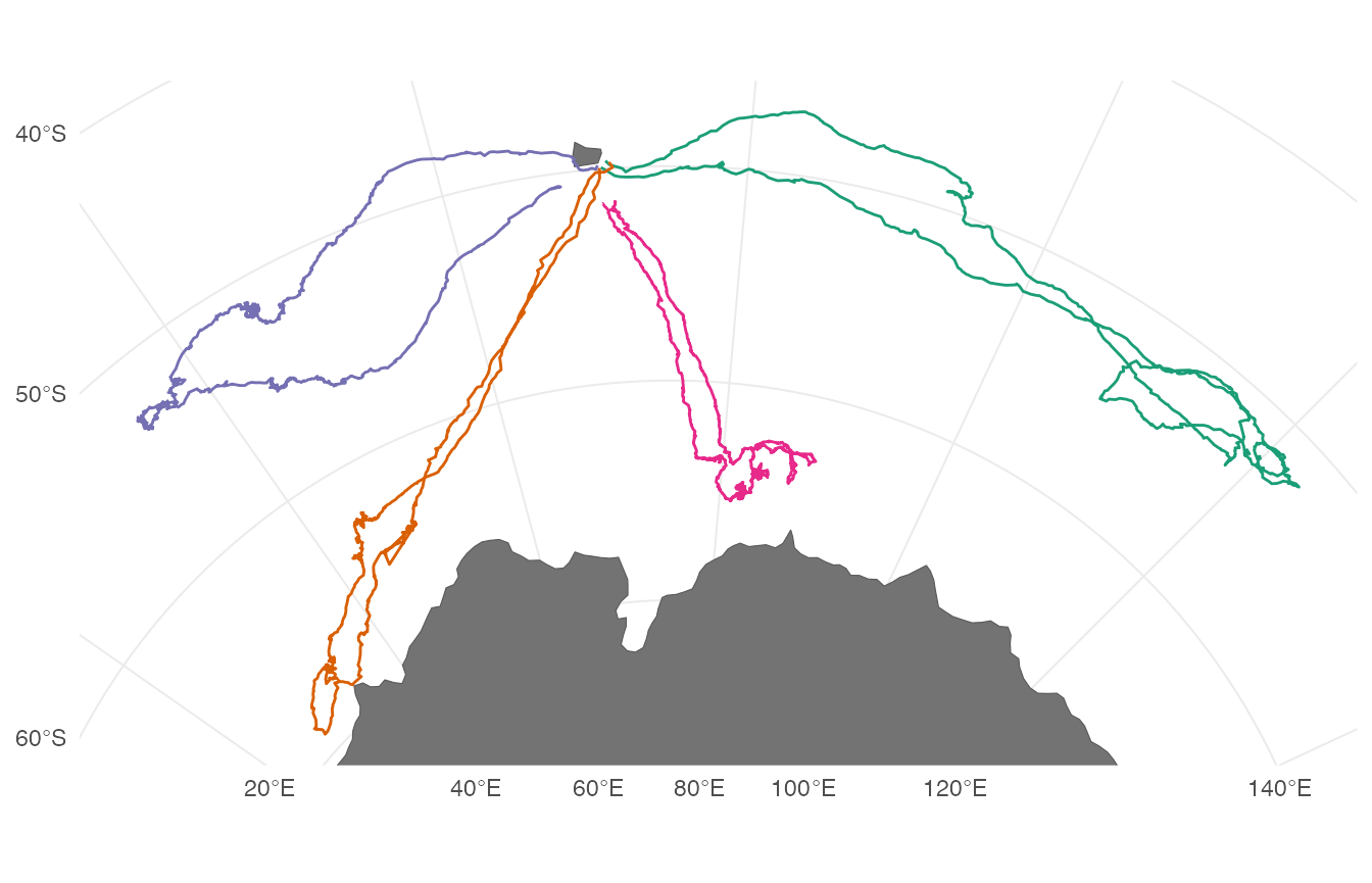
It is apparent that these southern elephant seals are central-place foragers and are undertaking a looping migration. However, it is unclear how long these individuals were tracked, if they all performed migratory movements at the exact same time, and how long they spent at foraging locations before continuing to travel in a fast and directed behavior.
While we could potentially subset these data to create a grid of
plots at some time interval of interest (e.g., days, months, seasons,
years), this can take unnecessarily long to try different combinations
for one or multiple tagged individuals. Additionally, it would be
difficult to explore patterns in the intrinsic properties of movement
itself (e.g., identify episodic periods of high site fidelity, looping
movements, or relationships in spatiotemporal patterns between
individual animals). Therefore, we have created a R Shiny application
within the bayesmove package to dynamically explore animal
movement patterns.
Dynamic exploration of animal movement patterns
Users can quickly render their data in the Shiny app using the
shiny_tracks() function, which only requires a data frame
and an EPSG code (or PROJ string) to map the tracks. At a minimum, this
data frame must have columns labeled ‘id’, ‘x’, ‘y’, and ‘date’ where
‘date’ is of class POSIXct. Any other variables can also be
included within the data frame, but only time series of numeric values
can be currently be visualized and explored.
In this example, the Lambert Azimuthal Equal Area, WGS84 projection (“+proj=laea +lat_0=-90 +lon_0=75 +ellps=WGS84 +units=km +no_defs”) is used since the coordinate units are in kilometers, which provides an intuitive set of units for step lengths and net-squared displacement. Upon first running the function, users are brought to a page that lists instructions and information for using the app (in the ‘About’ tab). Clicking on the ‘Explore data’ tab allows dynamic exploration of movement patterns from multiple individuals:
# Run Shiny app
shiny_tracks(data = sese3, epsg = "+proj=laea +lat_0=-90 +lon_0=75 +ellps=WGS84 +units=km +no_defs")
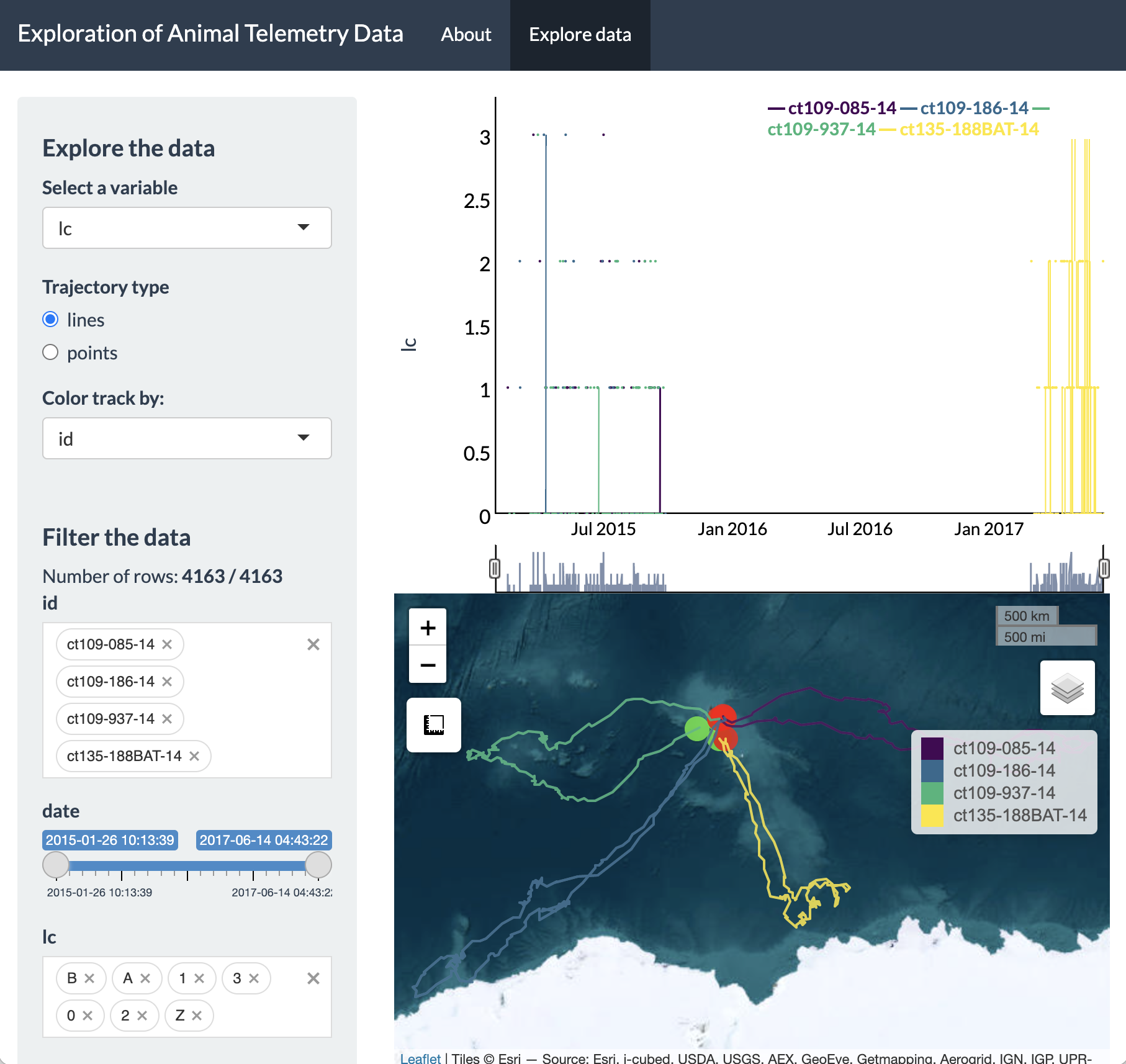
This screenshot shows the general layout of the Shiny app, which let’s users select a variable to dynamically explore, filter variables from their dataset, and visualize a time series plot as well as an interactive map of these data. Additionally, users can toggle between visualizing their set of locations as lines or points and change the color of the points according to a selected variable of interest. To provide a concrete example, let’s explore the southern elephant seal data further.
We can see on the sidebar that there are two main headers that break
up this panel: 1) Explore the data, and 2) Filter the data. Under the
‘Explore the data’ header, you can select any variables from your data
frame (besides id or date) to visualize an
interactive time series. Additionally, a radio button is provided to
toggle between mapping your spatial coordinates as a trajectory (line)
or as a set of points on the interactive Leaflet map. When viewed as
points (only), users can choose a variable from the “Color track by:”
dropdown menu.
Let’s say we were interested in exploring the East-West movement
patterns of all 4 individuals: we would click on the “Select a variable”
dropdown menu at the top and change this to x.
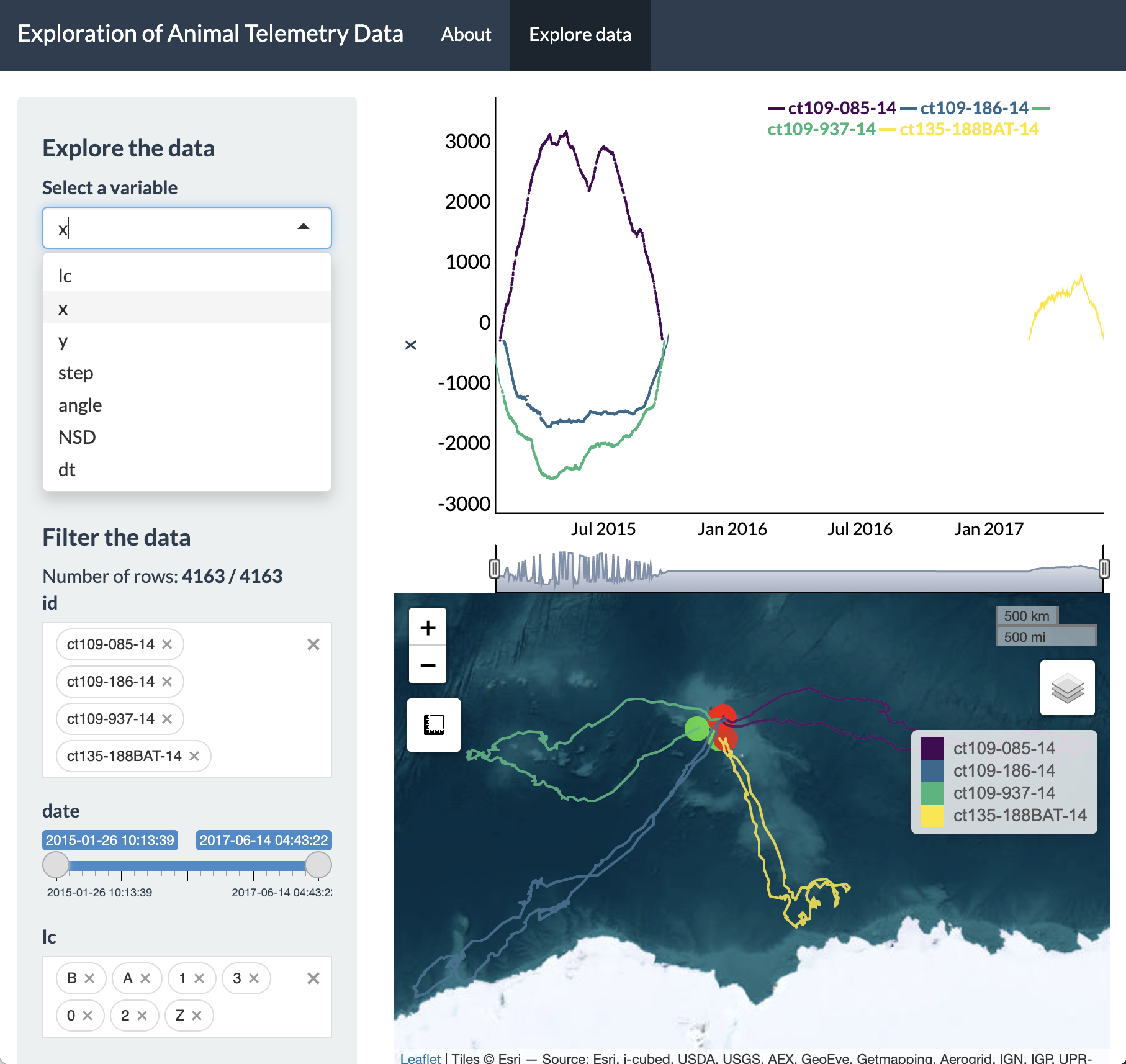
From this time series plot, we can see that three IDs were
transmitting simultaneously during 2015, whereas the remaining ID
transmitted afterwards in 2017. Additionally, it is also very obvious
that these seals are moving in a variety of directions from the island
of Kerguelen. The line plot and the tracks on the Leaflet map are both
colored by ID, where green circles denote starting locations and red
circles denote ending locations.
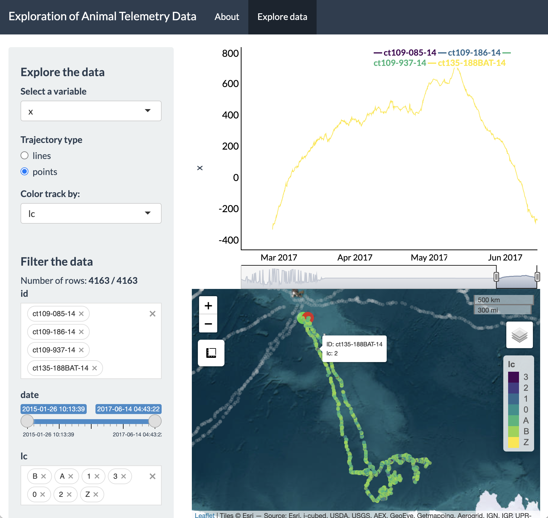
We can also switch to viewing the tracks as points and have these points colored by a variable other than ID, such as Argos location class quality (‘lc’).
To dynamically explore a more interesting variable, such as
net-squared displacement (NSD), we can change the variable in the
dropdown menu and then click and drag on the time series plot to only
highlight a particular time period of interest on the map (e.g., 2015).
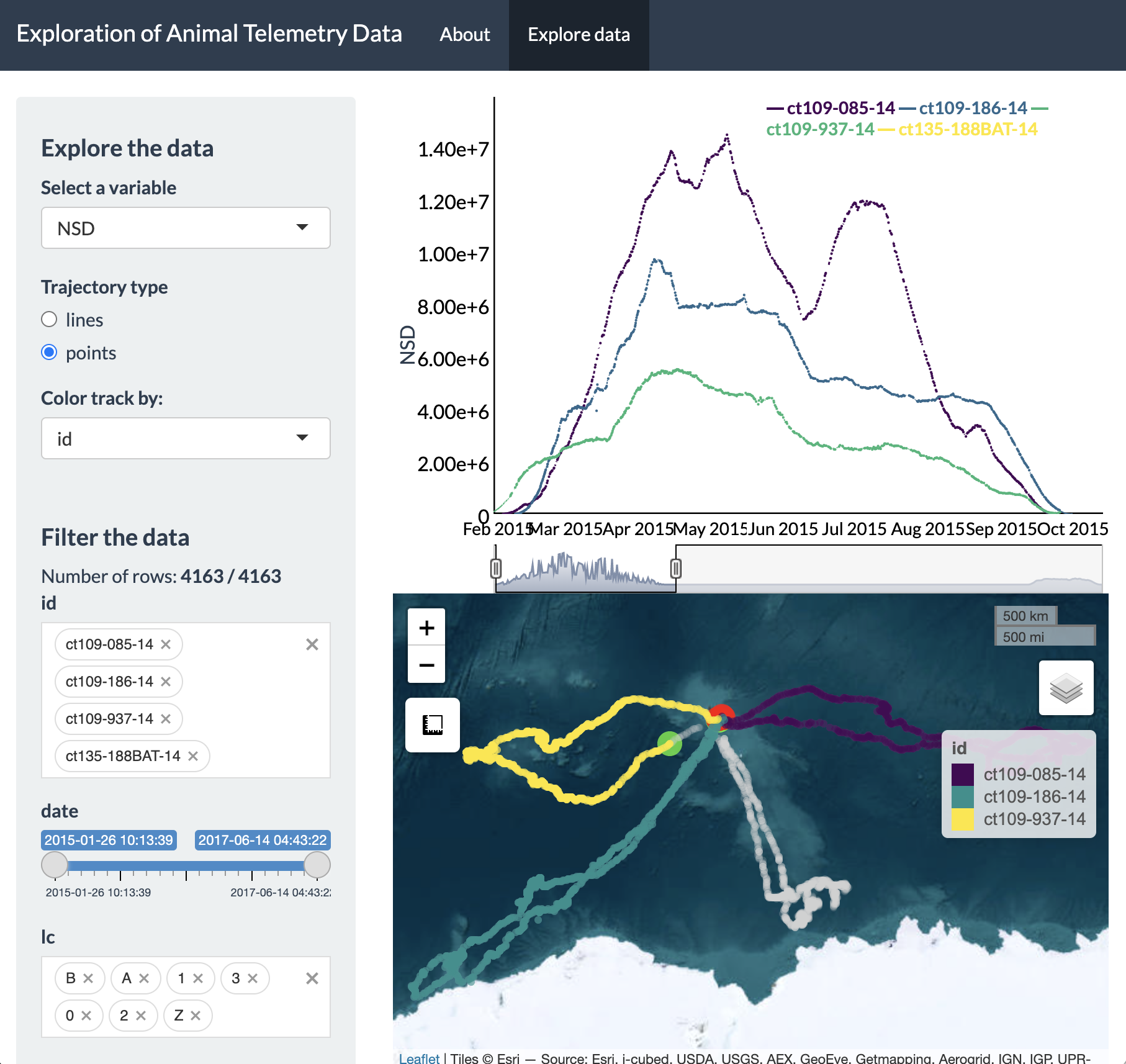
We now see a zoomed in version of the time series plot of
NSD and only the three IDs tagged in 2015 showing up on the Leaflet map.
This example demonstrates that updating the time window of the time
series plot will impact the map. Additionally, setting constraints on
variables from the “Filter the data” section of the sidebar will also
impact what data will be shown in the time series plot and map.
When inspecting the plot of NSD over time, we can see a
pattern where NSD is essentially zero at the beginning (February) and
end (September) of the time series, but in between it is gradually
increasing to its maximum value during the austral fall/winter before
gradually decreasing to zero by the austral spring. This is useful to
know, but we can inspect even finer temporal resolution patterns of
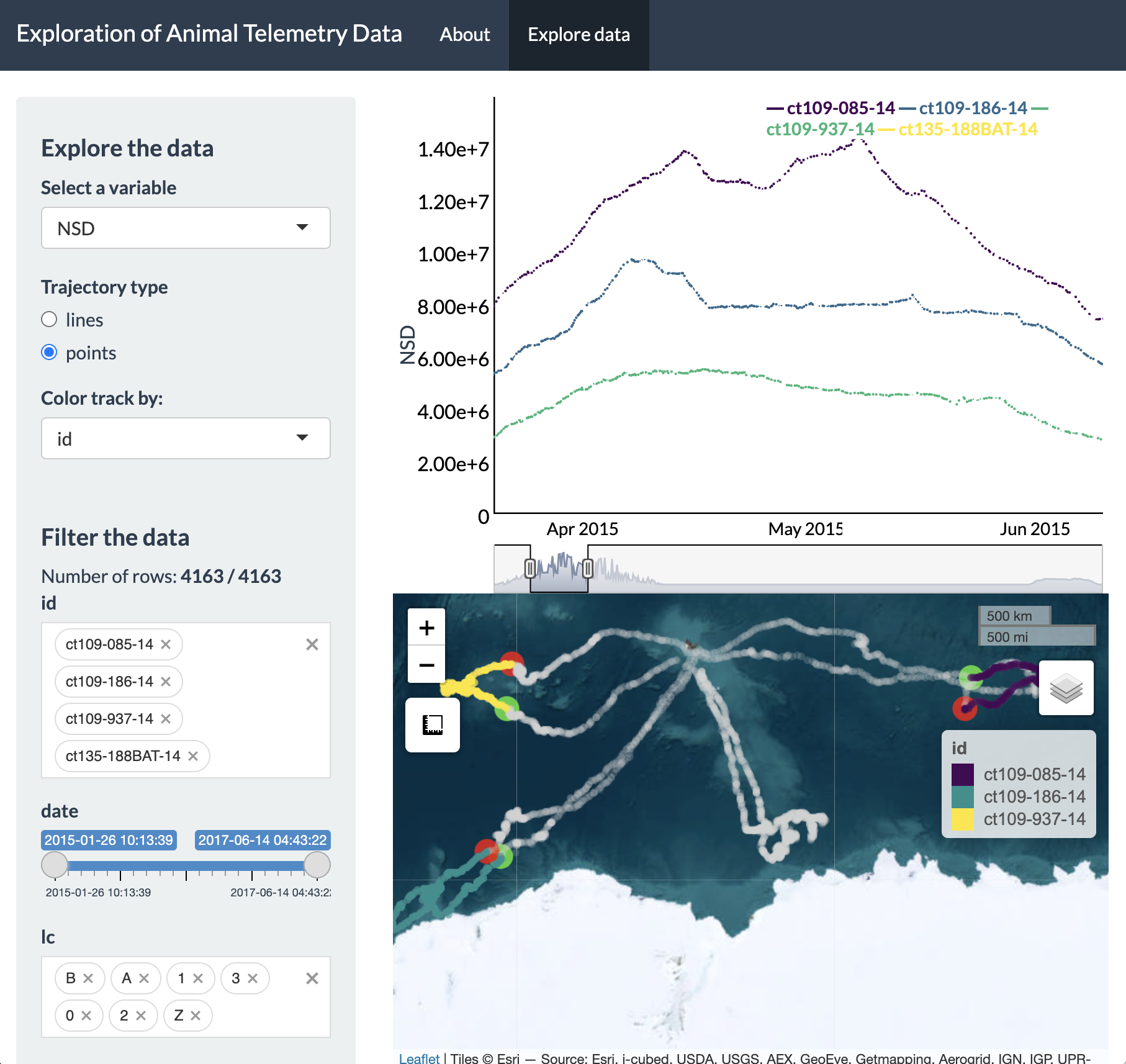
these movements, particularly at their greatest extent (i.e., April to
June). To do so, all we have to do is click and drag on the plot for
this time window and the Leaflet map will update the extent of the
zoomed-in tracks, as well as showing the full tracks in grey while the
“highlighted” time window is shown in color.
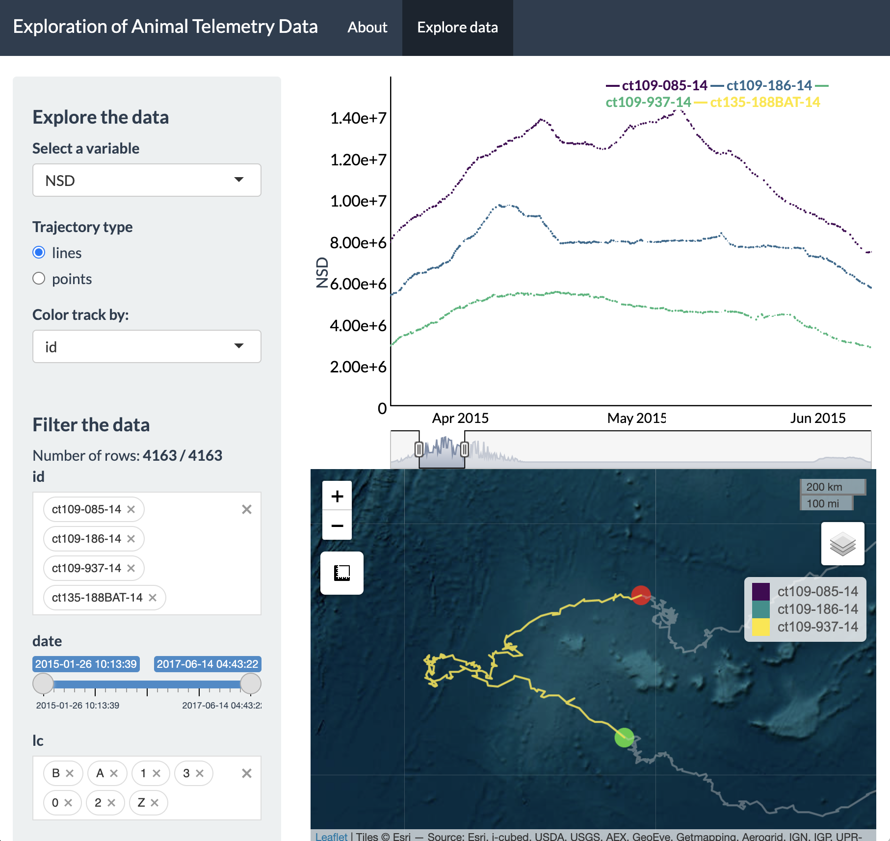
With this new time window selected, we can pan around and
zoom-in to each ID. The green and red circles denote the first and last
location for the selected time window, which has now been updated.
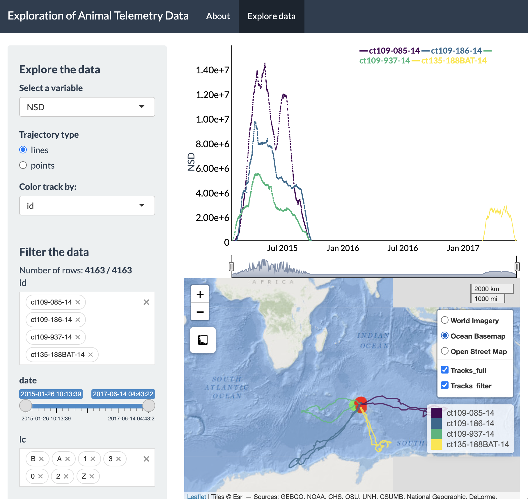
Additionally, the basemap can be adjusted and the tracks
can be toggled on and off (including whether you prefer to view only the
highlighted portion of the track, the full track length, or both).
An online version of this app can be found here. If
any other features are desired (e.g., loading raster layers, choosing
among multiple color palettes, etc), feel free to send requests by
e-mail (joshcullen10 [at] gmail [dot] com) or submit as an issue on the
GitHub page for bayesmove.
References
Jonsen ID, McMahon CR, Patterson TA, Auger-Methe M, Harcourt R, Hindell MA, Bestley S. (2019). Movement responses to environment: fast inference of variation among southern elephant seals with a mixed effects model. Ecology, 100:e02566. doi:10.1002/ecy.2566.
Jonsen I, Grecian WJ, Phillips L, Carroll G, McMahon CR, Harcourt RG, Hindell MA, Patterson TA. (2023). aniMotum, an R package for animal movement data: Rapid quality control, behavioural estimation and simulation. Methods in Ecology and Evolution, doi:10.1111/2041-210X.14060.